Mr Grace
A retro pink label mascot for a natural cleaning line, built to own a shelf.
- Client
- Mr Grace Eco-Cleaning Products
- Discipline
- Mascot
Eco-cleaning products almost all look the same: white bottle, green leaf, thin sans serif. Mr Grace took the shelf space nobody was using.
The badge
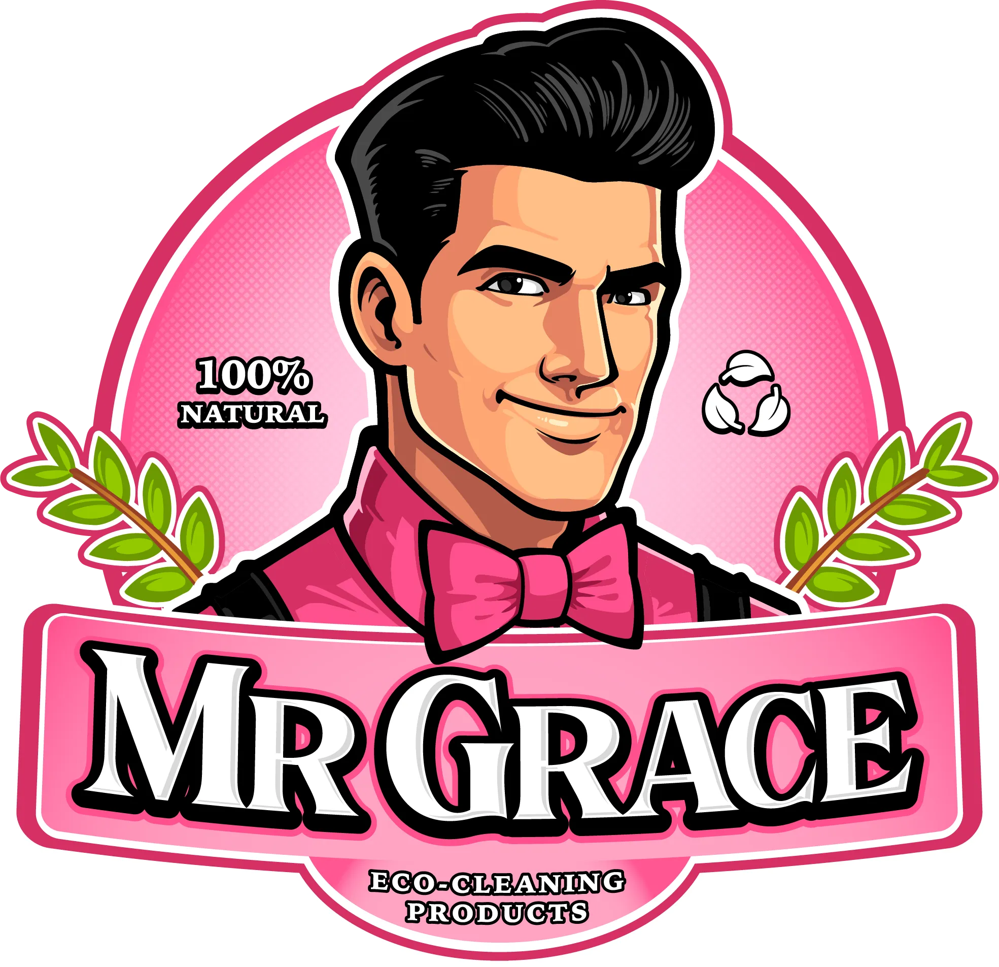
A retro leading-man face, half-smile, pompadour, pink bow tie, rendered in the heavier line and cross-hatched shading of an old advertising illustration. Laurel branches frame him and carry the "natural" claim, so the leaf does its job without being the whole logo.
Pink was the real decision. It is the last color a cleaning brand reaches for, which is exactly why it works on a shelf full of green and white.
The badge carries its own proof points. "100% NATURAL" and a recycling mark made of three leaves sit in the negative space beside the face, and ECO-CLEANING PRODUCTS runs along the bottom edge. Everything a shopper needs is inside one shape you can drop straight onto a label.