Mommy, Milk & Me
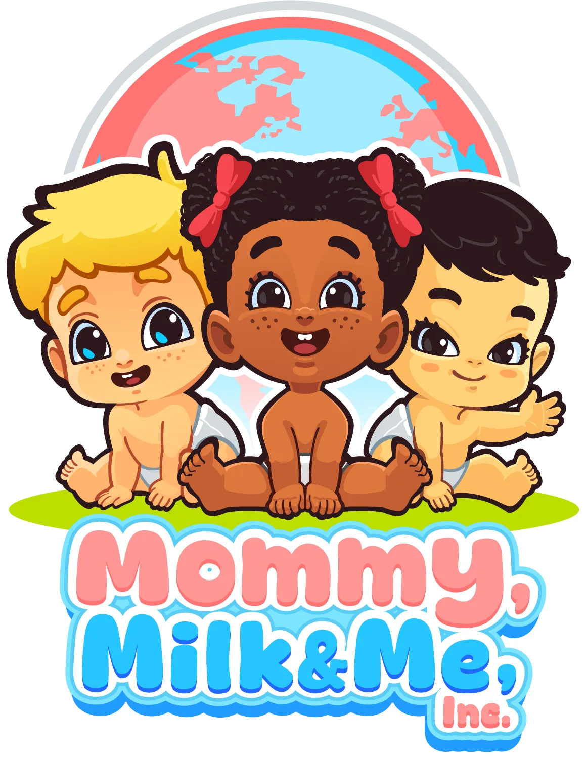
Three babies and a globe for a nursing and baby-care brand that sells to everyone.
- Client
- Mommy, Milk & Me, Inc.
- Discipline
- Character
A baby brand that ships worldwide needed artwork where every parent finds their own kid. That decision drove the whole design.
The characters
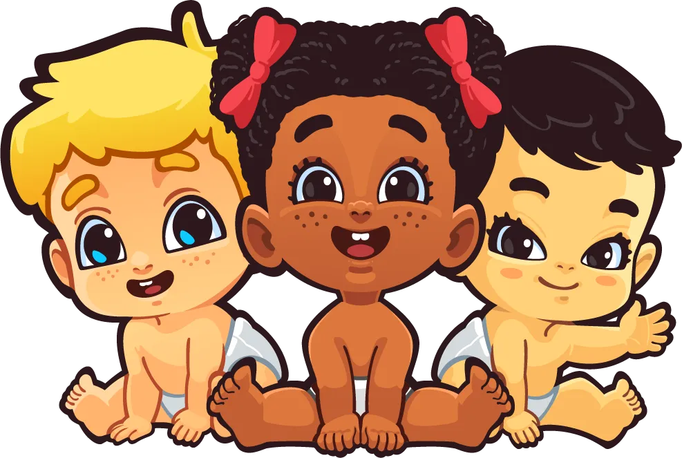
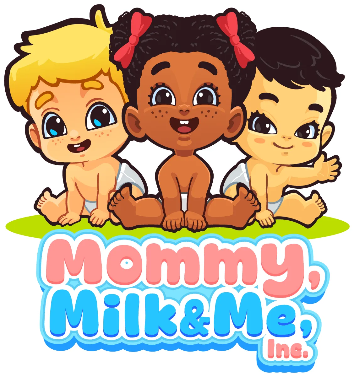
Three babies, three skin tones, three hair textures, all drawn with the same eye shape and the same line weight so they read as one set rather than three variations. Each has a different pose: one crawling, one sitting square to camera, one reaching out. Different enough to feel like individuals, close enough to sit in a row on a box.
The mark
A pink-and-blue globe arcs behind the babies. It carries the international story without a single word, and the two brand colors are already doing the work of the illustration behind it.
The wordmark
"Mommy," in soft pink script-weight rounded type, "Milk & Me," in blue below it, with a thick white keyline so the whole thing survives on a photographed product shot or a colored bag.